


ACTION!” the director shouts, and I slip on the headphones to watch another take. But my mind begins to wander from video village—parlance for the monitors where we sit on set—to a faraway village in the countryside of Wales. As a writer and producer on a brand new, star-studded, one-hour drama, I should be more excited, but my script took a beating before production at the hands of higher-ups, and the show’s disappointing numbers its first few weeks on the air have us all, cast and crew alike, wondering if and when the axe will drop. And so my mind wanders from the set here in Queens to a scriptorium nestled in a lush green valley freckled with cattle and sheep, where a small team of scribes and illuminators is working to complete the final two volumes of a seven-volume Bible written entirely by hand in the tradition of the great medieval manuscripts.
“Cut!” the director shouts, and a make-up artist sitting behind me resumes her diatribe with the hair stylist. “So, I’m like, ‘Fuck that!’ to the guy at the desk, right? Don’t be hiding no Bible in my room. And don’t think I won’t flush it down the toilet. You want to put your religion on me? Then put a Koran and Torah there, too!” A certain ecumenical spirit informs her vitriol. Perhaps there’s an unconscious aesthetic as well, a protest against the utilitarian ugliness of a Gideons Bible. I can sympathize.
I had recently seen Prophets, a volume of the Saint John’s Bible, on display at the Museum of Biblical Art, repeatedly in fact, and would return several more times before it closed. For better or worse, the Saint John’s Bible has changed my life.
In what the Smithsonian has called “one of the extraordinary undertakings of our time,” Saint John’s Abbey and University in Collegeville, Minnesota, has commissioned Donald Jackson, longtime scribe to Her Majesty Queen Elizabeth’s Crown Office and the most eminent living calligrapher in the western world, to produce the first illuminated Bible since Gutenberg’s invention of moveable type over five hundred years ago. The Benedictine tradition of patronage in the book arts is a long and rich one, going back to such masterpieces as the tenth-century Ramsey Psalter and the twelfth-century Winchester Bible. Today the tradition is more focused on preservation than production, and Saint John’s is renowned for its Hill Museum and Manuscript Library, which includes ten thousand rare books and the world’s largest archive of medieval and Renaissance manuscripts on microfilm. It was Saint John’s that in 1981 hosted the first Calligraphy Connection, a gathering of lettering artists from around the world, for what was to become an annual summer conference. That year, little more than a century after German monks migrated up the Mississippi River with books among their few possessions, Donald Jackson arrived on campus and began to plant the seeds for his illuminated Bible. Almost twenty years later, a sacred tradition would be revived.
The seeds had taken root in Jackson himself at an early age. This is a man who can still see the first successful egg-shaped O he wrote as a child, “as if it were yesterday.” He was raised in Lancashire, England, a Blakean landscape of coal mines and cotton mills, where his artistic talents came to the fore thanks to encouraging teachers and supportive parents. At the age of thirteen he left for art school on scholarship, and little more than a decade later he was laurelled as a scribe to the Crown Office—though even then, he needed to support himself by making diplomas, invitations, awards, bathroom signs, and menus. In the late sixties, he borrowed plane fare from his father and made his first trip to America. Perhaps it wasn’t exactly a storm by which he took the country, but when was the last time you saw a calligrapher on The Today Show? Fresh off the boat, in his early thirties, he announced on national television that his great dream was to make a handwritten Bible. Wherever he went, calligraphy guilds formed and flourished in his wake. The renaissance that had occurred in England decades before at the hands of his teachers was now giving rise to its American offspring thanks in part to him. Wherever he spoke, he made his dream known, hoping for a commission. Savvy man that he is, Jackson voiced this wish especially in the direction of Saint John’s, given the Benedictine tradition and this particular institution’s commitment to calligraphy.
In 1996, at lunch in Chicago with one of the brothers from Saint John’s, Jackson waited until they were partway through a bottle of Chianti before making his pitch. “How does St. John’s plan to mark the millennium?” he asked. He wanted them to commission a handmade book of the Gospels “in a form that did justice to the words.” He has written:
During one of my visits to the Abbey Church [at Saint John’s] some years ago, a monk held up a small printed Bible, brass bound rather like a miniature version of my great aunt’s embossed fire screen and said, “This is the Word of God.” For me, that book in that binding did not live up to his assertion.
On the one hand, there’s a bit of a fallacy here: if the Word made flesh took on the body of a peasant born in a manger, then even a book made of grocery bags would suffice for a record of it, and a fitting one at that. On the other hand, let us not forget the degree of beauty called for by Yahweh when the Israelites were told to build the Ark of the Covenant in the wilderness. The barrenness of their surroundings was no excuse not to glorify the Lord with a tabernacle. What excuse do we have, Jackson might ask, with all our abundance, not to create something magnificent?
Three years after that fateful lunch in Chicago, Jackson’s lifelong dream came true: a commission not only for the Gospels, but the entire Bible. It would be a glorious Bible indeed: 1,150 pages of vellum roughly two feet tall with 160 illuminations throughout, divided into seven volumes and bound between boards of Welsh oak. Now came the hard part.
§
My own first encounter with the Saint John’s Bible occurred two years ago when I finally made good on a long-time wish to take up calligraphy. It had begun with a sense of delight I felt in the mere images of ancient sacred texts and their modern inscriptions, be it the Dead Sea Scrolls or the Gospel of Matthew rendered in Rudolph Koch’s gothicized, expressionist hand in post-World War I Germany. When my wife gave me a copy of Sister Wendy Beckett’s Meditations on Peace, it was a decorated page from the Koran—the one manuscript in a book of mostly paintings, yet a painting in its own right—that I returned to again and again. I did find a sense of peace in it. After a class in italic at the Society of Scribes in New York City, I found my way to private study with Christopher Calderhead, a calligrapher, writer, and Episcopal priest who soon became my mentor and friend.
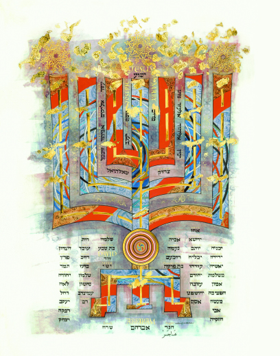
Plate 9. Donald Jackson. Genealogy of Christ, 2002. All work is in natural hand-ground ink on calfskin vellum. Full manuscript page: 24 ½ x 15 ¾ inches. All images are copyright of the Saint John’s Bible and the Hill Museum and Manuscript Library, Saint John’s University, Collegeville, Minnesota.
He arrived at our first session with books in hand, including one of his own, Illuminating the Word: The Making of the Saint John’s Bible. One look at the reproduction of the illuminated frontispiece to Matthew’s Gospel, Genealogy of Christ, and I was transfixed [see Plate 9]. A tree-like menorah bridges the Old and New Testaments, depicting the family tree of Jesus going back to Abraham. The names are written in Hebrew, except for the humble name of the maidservant Hagar, mother of Ishmael, which is written in Arabic—an acknowledgment of the third great Abrahamic faith. Clearly this was a Bible with an ecumenical mandate. Its motifs include Islamic candles and a Buddhist mandala. It was also a Bible meant to pay homage to science. Rubber-stamped double helixes swim between the branches of the tree, symbolizing strands of DNA across generations. Had that make-up artist on set found the Saint John’s Bible in her bedside table at the motel—had she seen the Loaves and Fishes illumination from Mark’s Gospel with its spiral patterns of Native American baskets, or the Creation frontispiece to Genesis with its fractals and satellite imagery of the Ganges river—she might have revoked her threat to flush it down the toilet.
And then there was the mesmerizing script. Seemingly simple, but invisibly complex. The composition of an original script to suit his vision for the Bible was Jackson’s primary task once the creative work began. He uses quills taken from the first three flight feathers of a swan, goose, or turkey, then cured in hot sand and cut with a penknife. This choice is not based upon the sentimental values of a Luddite with his heart stuck in the Middle Ages, but on the seasoned knowledge of a master. Natural quills have that extra ounce of fluidity; they transmit energy from the body onto the page in a way a metal nib can’t. Putting a quill to the velvety nap of vellum, Jackson says, is like writing with a fingernail on the skin of an infant. Vellum is practical, too: mistakes can be erased by scraping the ink with the edge of a knife, then buffing out the blemish. Historically, this allowed a margin for error in illuminated Bibles, which is not to say there aren’t mistakes left unchanged, even in masterpieces like the Book of Kells. There are. By contrast, in the scribal disciplines that serve the Torah and the Koran, a single mistake calls for the entire page to be destroyed.
Having decided on a two-column layout in the spirit of his main influence, the Winchester Bible, Jackson wanted the script to have “speed, flexibility, and juice.” He writes:
I had a clear sense of what texture I wanted—strong enough when arranged in a two-column format to support powerful illuminations, yet rich and intricate enough to sustain the eye over the many pages where writing stands alone without embellishment.
After many trials, Jackson arrived at the finished script, which was not a far cry from the one he had initially tested. At the last minute, he decided that having both left and right margins justified would lend an even greater sense of grandeur. Such a format was not a problem for the medieval scribe, in that the rules of Latin composition allowed for a word to be broken at any given letter, but you can imagine the challenge flush margins pose in English, given our syllabic rules for hyphenation. Because calligraphy is based upon the rhythm of black and white spaces across the page, letters are shaped as much by their counters (their negative space) as by their written forms. Therefore, using extra white space between letters to force-justify the text, the way a printed Bible does, would be downright unthinkable. Enter the computer, an invaluable tool in this otherwise manual endeavor. With his trusted technical consultant, Vin Godier, at his side, a malleable computer font to simulate his script, and a color scheme to render the general sequence and size of the illuminations or special treatments (highlighted texts) to come, Jackson could see a rough layout of the entire Bible before a single page had been written. Godier devised a system to meet the challenge of flush right and left margins, by which those lines calling for compression would be coded in green to alert the scribe to make necessary adjustments.
In the meantime, along with fundraising, budgeting, and an international search for a supplier of vellum to meet his demand for quantity and quality, Jackson had worked to convert an unused garage across the street from his home into a scriptorium and sent out invitations to his prospective team of scribes and illuminators. At first the team included only Jackson and three others: Sally Mae Joseph (also Jackson’s in-house illuminator and studio manager), Brian Simpson, and Susan Hufton. Later, Susan Leiper and Angela Swan would join. The first order of business was for the scribes to gather in Wales for a two-week intensive training in the script, and the learning curve was a steep one even for masters such as these. According to Hufton, a commensurate challenge was learning how to cut and trim a quill, and use it on vellum. But these ancient tools and methods came to be a source of joy and freedom. The teamwork was rewarding, too, she says, a rare phenomenon in the mostly solitary work of calligraphy. After an initial period of writing pages under Jackson’s supervision, the scribes went home with their quills, layouts, and rolls of vellum in hand, scheduled to return to the scriptorium every six to seven weeks for regular deliveries and analyses of their work.
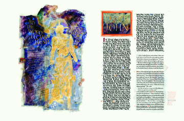
Plate 10. Donald Jackson. Christ Our Light, 2002. All scripture quotations are from the New Revised Standard Version, © 1993, 1989 National Council of the Churches of Christ in the United States of America. Used by permission. All rights reserved.
On Ash Wednesday, 2000, Jackson sat down to make his own first inscription for the Saint John’s Bible: the incipit (opening) page of John’s Gospel [see Plate 10]. “In the beginning,” it reads, Jackson’s signature bravura flowing from a goose quill into what is known as the display script, the more prominent lettering with which a book begins, his bold majuscules (capitals) marching across the first fourteen verses towards the smaller script that would carry the rest of the book except for special treatments. With cameras rolling at his shoulder to mark the moment, Jackson managed to keep the writing natural. “Natural” is perhaps the wrong word altogether, as this vigorous and breathtaking act of calligraphy reflects nearly five decades of disciplined yet adventurous engagement with the craft. When my mother offered to get me a lithograph from one of the finished volumes for my birthday that year, it was this page that I wanted without question. I was dismayed at first when I discovered that the only available reproduction also included the illuminated frontispiece, Christ Our Light, that appears opposite. Something about the illumination, the cosmically gargantuan figure of Christ, disturbed my pleasure in the display script on the adjacent page. Only recently have I come to understand why.
With his scribes off writing the first volume, Gospels and Acts, Jackson could now turn his attention to the graphic aspect of the Saint John’s Bible. The word illumination derives from the play of light off gold leaf as a page is turned, a phenomenon meant to render the shimmering presence of God. Five centuries later, many of the masterpieces still radiate this effect as beautifully as the day they were made. One thing was certain from the start: there would be a rich use of gold throughout. But what kind of images would a twenty-first-century illuminated Bible call for? Would it follow the more literal mode of its great medieval forbears, or would it take a more abstract approach in the wake of modernism’s about-face from conventional representation? Both, as it turned out, with a preference for the latter grounded by the former. And Donald Jackson, for the first time in his life, would have to submit his imagination to a committee.
Far from a one-man show in either conception or execution, the 160 illuminations throughout the Saint John’s Bible are the brainchild of the sometimes uneasy marriage between Jackson and the Committee on Illumination and Text at Saint John’s. Its Soviet-sounding moniker notwithstanding, the CIT is mostly a group of Benedictine brothers and sisters from Saint John’s, along with members of other orders and secular scholars. Their fields of expertise or practice cover a range of disciplines: art history as well as the creative arts, medieval history, and biblical scholarship. They formed an overall plan for the illuminations and advised Jackson throughout. It was they who decided which passages would be accompanied by illuminations or special treatments. For each designated passage, the CIT would compose a detailed, four-part brief: an exegesis, an explanation of the text followed by varying interpretations; free associations, in which the CIT would let their imaginations riff in a group session; biblical cross-references, to point Jackson to related passages which might inform his design; and local associations, flora and fauna of the woods and prairies around the abbey, to place the Saint John’s Bible in its native context as well as celebrate the wonders of creation.
In Wales, Jackson would consult the briefs and Scriptures, feeling his way imaginatively, trying to locate the moments, symbols, and emotions at the heart of the passage. Then he would make a rough sketch, which would be digitally photographed and e-mailed to the CIT. A back-and-forth process would eventually yield a so-called happy medium. Jackson has said: “Most artists I know wouldn’t dream for a minute of working for a committee…. When I first started, I said to everybody there, ‘If I don’t upset some of you on this committee, or in this community, then I will have got it badly wrong. Because I can’t please everyone.’” But the medium has only grown happier with time, as the two parties have come to anticipate and appreciate each other’s creative instincts. Christ Our Light is as good an example as any of how the exchange between Jackson and the CIT takes place. Jackson writes:
My first design…had Christ the Shepherd as a gilded figure (the Word made flesh) stepping out of shadows and cosmic chaos accompanied by angelic acolytes flying above his head. The CIT was concerned that there might be an implication that Christ was also an angel. Theologically, this would be inappropriate. The shepherd’s crook was also out of place here and had to be discarded. They also liked the idea of the inclusion of more cosmic imagery in the background. So, I replaced the angels with part of the quotation…and brought in some Hubble-inspired outer-space imagery into the background which re-created a similar feeling of energetic movement which the angels had previously provided. It is easy to see by this what a challenge it is to introduce other interpretive artists to an interactive process which has evolved over a period of time and demands a high degree of intuition…. This [collaborative] process has begun to work so well, it has been one of those wonderful surprises that this project can create.
Multiply this single process by 160 illustrations, and you get a ballpark idea of just how draining and rewarding the experience has been, and continues to be, for all involved.
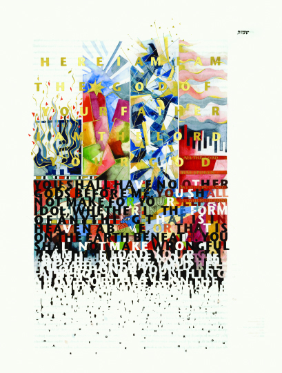
Plate 14. Thomas Ingmire. Ten Commandments, 2003.
Not that Jackson has had to go it alone on his end, as the Ten Commandments illumination shows, a trademark tour de force by world-renowned lettering artist Thomas Ingmire [see Plate 14]. A student of Jackson’s from the seventies, Ingmire was invited by his former teacher to do several major illuminations for the Saint John’s Bible. Ingmire’s work is often concerned with the phenomenon of the alphabet and the written word’s implications for society, so the story of the Ten Commandments was tailor-made for his artistic sensibilities. His abstract renditions of four supernatural stories from Exodus are laid out in columns at the top of the piece: the burning bush, the first Passover, the parting of the Red Sea, and the encampment of Israel before Mount Sinai and the presence of God. Below this sequence is a representation of God’s gift of the law to Moses at Mount Sinai. A veritable storm of letters descends from the cloud that the Lord inhabited with his servant. The letters are mostly black and white, symbolizing the clarity that the law bestowed, while a colorful, chaotic background represents the pagan motifs of the Egyptian culture the Israelites had escaped. Yet even the law, the very imprint of Yahweh’s will for his people, diminishes and disappears as it moves down the page, in accord with midrashic commentaries of the medieval rabbis, who imagined the holy letters broken and dissolved by human faithlessness.
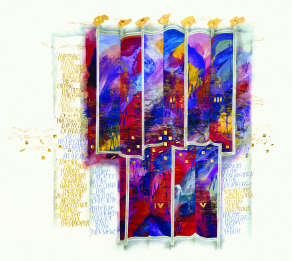
Plate 11. Donald Jackson. Psalms Frontispiece, 2004.
In all the Saint John’s Bible, perhaps a detail of Psalms Frontispiece exemplifies the collaborative efforts of Jackson and the CIT at their most inspired [see Plate 11]. The vibrant, turbid brushstrokes in alternating modes of light and dark evoke the motif of bondage and deliverance—both corporate and individual—which the Psalms recall from Exodus. While at a bar mitzvah, Jackson had seen a boy almost fall while carrying the heavy Torah scroll to the altar, and in this frontispiece, he wanted to capture that same sense of being overwhelmed. A wall-like wave, suggestive of the Red Sea, appears and disappears across five panels. (The Psalms are traditionally divided into five books.) Look closer and you notice an array of graph-like patterns, horizontal bars of gold and vertical bands of varying color and shape. These are digital voiceprints of song from a spectrum of sacred traditions. An oscillograph rendered the recordings into patterns that were then transposed onto rubber stamps. The resulting image is of something like a liturgical rainbow: the monks of Saint John’s singing Gregorian chant reappear on every page throughout all five books, representing the sung psalm cycle that is the center of monastic worship; there are also oscillograph renderings of a Jewish men’s chorus, Native American sacred chant, Buddhist tantric harmonics, an Islamic call to prayer, Taoist temple music, Hindu bhajan, and Sufi chant.
§
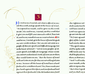
Plate 12. Susan Lieper. Text Detail from Ezekiel, 2005.
I finally saw part of the Saint John’s Bible in person when the fourth volume, Prophets, came to the Museum of Biblical Art in New York last September. The grand original illuminations dwarfed all my expectations, but it was the script that surprised me most. The towering columns of text were as majestic as the illuminations, perhaps more so. The reproductions I’d seen were a pale glimpse of the real thing, and with the fifth anniversary of 9/11 upon us, the double-column layout with its twin towers of scripture had an especially fitting resonance. No sooner had I entered the spacious, well-lit gallery than I found myself standing before one of my favorite passages in the entire Bible, the third chapter of Ezekiel [see Plate 12].
Even the lackluster typography of modern Bibles had failed to blunt my sensual response to that opening command, “Eat this scroll.” I had long relished the thought of Ezekiel literally consuming the scroll—for nourishment more than for knowledge—a prophetic act itself in advance of the Word made flesh. As I stood before the words of Ezekiel in their Jacksonian script—written here by Susan Leiper, the scribe responsible for most of the prose in the Prophets volume—that same hunger was alive in me. As was a sense of peace, a somatic echo of what I first felt when looking at that page from the Koran in Meditations on Peace. That night at mobia, and several times when I returned to the exhibit later, I was calmed by the pages before me. The haste and waste of a New York day were washed away in their presence. Or rather, burned away. The Jewish mystic tradition holds that the Torah was given by God to Moses in the form of black fire superimposed on white fire, a phenomenon reflected in the exquisite simplicity of a Torah scroll, with its flame-like Hebrew letters spreading across the vellum as the scroll is opened. While the Hebrew alphabet lends itself better to the image of fire than ours does, the guiding principle in each system of calligraphy is the same: the rhythm of black and white gives equal weight to the letter forms and their counter shapes. In other words, what is not written is just as important as what is, and in some ways even more so—a principle whose spiritual correlative speaks for itself: the only means to fullness is by way of emptiness; except for absence there is no Presence.
I could stand before a page from Ezekiel as long as I wanted—or as long as the kind staff of mobia would let me—mesmerized by its beauty and persuaded by its message. Was it because of this spiritual principle that the experience could turn the detritus of a busy day to ash? Or had the scribe somehow transmitted her own experience of peace onto the page? In an e-mail, I asked Leiper what religious or spiritual background, if any, she brought to the project, and whether the project had any impact on it. Though she says it didn’t affect her agnosticism “since a quick burst of Christianity at the age of fourteen,” she does relate, almost in spite of herself:
Once I got better at the writing and the quill cutting, and if it was nice vellum and a bright sunny day, I would sit at my desk in the window in Edinburgh, writing, and something would happen to me: I was lost in my world of writing, as if on another planet, not answering the phone, speaking to no one. I now imagine that must be what people call a “spiritual experience” (although I am hesitant about the possible pseudiness of that term). Donald would say that was when the writing was coming from somewhere deep down. I think he’s right.
I’d like to think that the peace I felt had to do with both the calligraphy and calligrapher.
For her part, Susan Hufton, raised in the Methodist Church in England, did feel the project’s impact upon her faith:
As time goes on I am discovering how working on the project has changed me and will continue to do so. For example, before…I felt that perhaps the Old Testament had less relevance to me than the New Testament. To my surprise, having written out a large part of the Old Testament, I found an incredible resonance for today…. And in all the text I wrote I found new insights for myself, simply because the act of writing out a text slowly and carefully is a meditative process and gives space and time for contemplation.
For each scribe, their divergent paths notwithstanding, the work seems to have been a kind of scrivio divina, or divine writing. The sun at Leiper’s window, after all, shines on all alike.
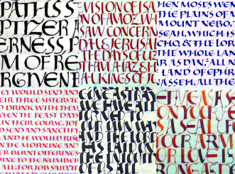
Plate 13. Donald Jackson. Calligraphy Details, 2002. Clockwise from upper left: Mark, Isaiah, Deuteronomy, Song of Solomon, Isaiah, Job.
When he spoke at mobia at the time of the Prophets exhibition, Jackson explained that the methodology behind his work is a “perfection of instant heart,” in which spontaneity itself becomes a kind of discipline. Flawlessness has no place in his sense of artistic virtue, instead he values the immediate engagement—creatively, emotionally, bodily—that the artist generates with the work before him. Jackson insists upon the role of play, even a kind of foolishness, in the painstaking work of lettering and illumination: “You have to be mad,” he says, “to get two consecutive S’s to look alike, let alone one of them to look halfway good.” All the preliminary thought and planning of the Saint John’s Bible is a given, but it is the artist’s intention at the moment of execution that matters most to him. As testimony, the constant freshness of his script is strikingly evident in a pastiche he has made of samples of his lettering throughout the project [see Plate 13].
Jackson did not come to this project, in his words, as “a committed Christian.” He was committed to the stories of the Bible, and to their relevance to the human condition above any and all religion. Perhaps it is being an outsider to organized religion that keeps his approach so fresh. “Some images are jarring,” he said the night I heard him speak at mobia, “but so is the text. The jumble is a reflection of the reality of the Scriptures.” One can like or dislike the images themselves, but one can hardly dispute this. By now, the cosmically gargantuan Christ in my lithograph of Christ Our Light had grown on me, but after hearing Jackson, I appreciated it all the more. Its jarring quality gets at the otherworldly side of our faith that tends to get lost, tamed, or demystified in the fray of everyday life. If the figure was disturbing while the text opposite it was soothing, so be it. Anything homogenous would have missed the point.
Ten years into his vast project, Jackson has two of the seven total volumes awaiting completion, Historical Books and Revelation. He expects them to take two more years. He’s the first to admit he is utterly exhausted, and his main job now, as he sees it, is to build up his energy. In a BBC documentary, he admitted that at times he’s mainly driven by fear of failure: “Someone’s going to see I’m not really an artist, that this challenge is too big…. I’m going to be humiliated.” Will he be found out to be a fake? Will he get critical acclaim? These questions haunt him in the middle of the night, and like the boy he saw tottering under the weight of a Torah scroll, Jackson knows the feeling of being overwhelmed. At times deadlines and demons alike have seemed too much to bear. But difficult as it is, the work is also what sustains him:
When I was a nine-year-old, desire led me to copying ancient scripts and decorated letters. I loved the feel of the pen as it touched the page and the breathtaking effect of the flow of colored ink as its wetness caught the light. Those sensations, which I still experience as I work, are what seem to select the shapes and colors of my designs or words. The quill, not my conscious thinking, makes the choice. The continual process of remaining open and the accepting of what may reveal itself through hand and heart on a crafted page is the closest I have ever come to God.
With the finish line in sight, Jackson will write Revelation entirely by himself, having written a comparatively small number of pages thus far in order to focus on the illuminations, special treatments, and display scripts. Where it began is where it will end, with Jackson alone at his desk in Wales. One can only imagine the reverberations of “Amen” when he writes that very word, the last word of the Scriptures, and, incidentally, of the apostle for whom the Saint John’s Bible is named.
As for me, I’m waiting in my bastardized scriptorium in Queens, a writers’ room on a TV show, watching the traffic on the Long Island Expressway, thinking of a Welsh hillside dotted with sheep. Our staff has disbanded, on hold as we await news of our fate from network executives in Los Angeles. I’m also waiting for news from London, where the fate of the rigorous classical calligraphy program at Roehampton University, the last of its kind, is being decided. Despite a roster of eminent alumni (including three of the scribes from the Saint John’s Bible), word is that Roehampton might shut the program down. Few people are interested in studying calligraphy in the age of computers. The fantasy of a sabbatical to England, with my longsuffering wife and girls in tow, has sustained me through several cancelled shows and thousands of dirty diapers these past two years. If the program at Roehampton does survive, and the show does not, there’s a good chance we’ll do what it takes to make the sabbatical happen. And if we end up hungry on the expensive streets of London, I’ll have Donald Jackson and the Saint John’s Bible largely to blame. No doubt, though, the sign I make for work or food will look pretty damn good.
